


Simplicity is the key
This is probably the most important point. A good logo is very simple, and the reason for this is so it can be easily recognized. When you have a simple logo it can be easily resized and it will look good when it’s small and when it’s the size of a building. Viewers won’t have to guess if it’s a logo or part of a photo. When designing a logo avoid Photoshop effects like shadows, transparencies, textures and gradients. Or at least make sure your logo still looks good without them, since sooner or later you will have to use it somewhere where you can’t use those features (signage, embroidery etc). Just keep it simple and think of iconic logos like Coca Cola, Apple, Nike etc.
![]()
Make sure your logo looks good in black and white
So you made a really good logo, you got it printed on shirts and hats but now you have to put it in the newspaper and it comes out like a big black shape. One of the important design things to consider is remember to test your logo on both the white and black backgrounds. If your logo has shades of color (which it shouldn’t) make sure it still looks good in black and white on black and white backgrounds. Usually you will have to design 2 versions.
![]()
Avoid generic shapes
A lot of the times when we try to make the logo “simple” we end up with something nice and sleek simple. However, most of the time it is also so simple that it has probably been done before. This means your brand won’t stick with the consumer, you will just be another generic company. That’s why you usually have to go through many ideas before something unique comes out.

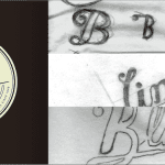
Don’t just use a font to make your logo
This is definitely an easy way out: open up word, type your company name then just go and change your font to something else. If you want to do this then at least play around with font sizes and rearrange the words. You will get much better results!
![]()
Watch out for bad dimensions
I admit I still make this mistake myself. We design a cool logo that is simple, iconic and looks great. Only one problem: it is taller than it is wide. Now it’s a nightmare to use it for headers or anything else. When you are designing a logo make sure you think of where it will usually go and how it will look.
![]()
Stick to the above and you will be on your way to making some great identities. Got any other pointers that you think I missed? Let us know!