Fonts are used to deliver a certain look and feel in a message you are trying to communicate. Mixing and matching different fonts create visually pleasing designs and add more thought to it as well; but a design can get out of order if you have too many fonts that you want to use. Here are 5 rules to mixing fonts that will guide you to your next successful design.
1.)Select Fonts Based on Your Content

Keep in mind of what your design is trying to communicate. Ask yourself what type of design you’re trying to make, is it modern? Old fashioned? Conservative? And of course, who are you trying to appeal to? If you’re trying go for a modern design, you may want to stick with two sans serif fonts that have opposite line thicknesses. For a more conservative look, try using serif fonts. Serif fonts have subconscious ties to classicism and can be mixed with other serif fonts that are recognizably different.
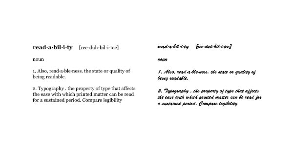
2.) Readability is Key

The most important part of your design is the information you are trying to send out. Keeping that in mind, your body text will more than likely have the most important information so it needs to be legible. Avoid decorative fonts that make it difficult for the eye to flow through. Let the reader get the information easily. Less is more, so stick to something simple.
3.) Avoid Similar Fonts

When a design has two fonts that have similiar characteristics, it can become distracting to the eye. Instead of looking at the overall design, the viewer is now trying to figure out what the meaning is between the two. If you decide to use similar fonts, make sure you differentiate their characteristics; this will help identity the two font’s individual purpose.
4.) Mix Sans Serif With Serif

Mixing sans serif with serif type creates visually pleasing designs. It adds dimension to the text which can be a dynamic element to the lay out. The combination clearly defines the role of each font and it gives you more options for character styles. Try combining a bold serif header with a light sans serif body text. Play around and switch their roles, see which you feel is more appealing.
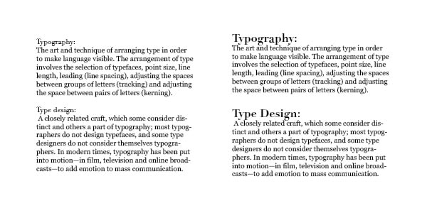
5.)Pay attention to scale

Scale is very important to a layout. It visually organizes the reader and helps them determine the different subjects that are presented. Larger font sizes should be specific to subjects, headers and titles. Smaller font sizes should be information specific. Different scales work harmoniously together for better communication.


