With responsive design quickly becoming the new standard, more and more sites have begun to use fluid column layouts. What this means is that the layout will automatically adjust to a screen’s size by changing width. That’s great, until things can no longer fit into the space that has been allocated to them. One approach is, of course, to use media queries but this will not work for all cases, and sometimes you just need fixed width elements within your fluid layout. Here is one way to solve the problem:
Regular fluid layout
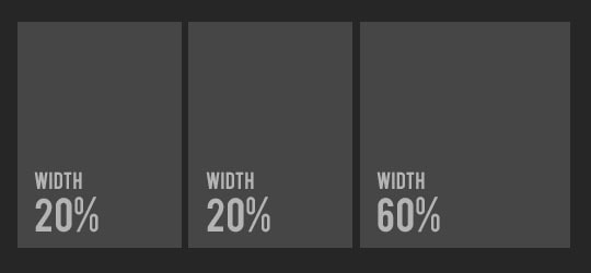
The regular fluid layout can have multiple columns in it where width is set as a percentage. If you need help setting this up there are many tutorials out there that cover this topic.
Fluid layout with fixed columns
What happens when we need to only have one column to be fluid and others with set widths like so?:
For a real world example where we used this set up:
The first 2 columns have set widths and the last column will dynamically change depending on the screen size.
How it’s done
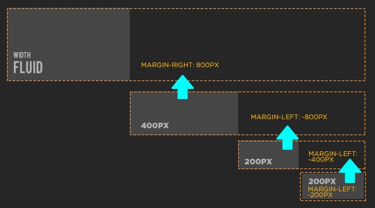
The main problem is that you can’t just use width: auto and then float the elements to the left with fixed width. That approach won’t work (and will frustrate the hell out of you in the process). So here is our non-elegant workaround that, in fact, works wonderfully:
- Create a fluid element and give it a right margin big enough to fit the fixed width elements.
- Make the fixed elements and offset them by the same margin amount so they will fall into the empty spot next to our fluid column.
- Make everything float.
An illustration of how it will work:
Alternatively, we can force our fixed width columns into the open margin space with absolute position, but the height of the columns will not auto adjust with the fluid column height.
The Code
We will just show the css examples here:
#contentwrapper{
float: left;
width: 100%;
}

#fluid-column{
margin-right: 800px;   /*Set the right margin to (LeftColumnWidth + RightColumnWidth)*/
}

#column-one{
float: left;
width: 400px; /*Our fixed  width*/
margin-left: -800px; /*Set left margin to width of column + space for our 2 other blocks */
background: #C8FC98;
}

#column-two{
float: left;
width: 200px;
margin-left: -400px; /*Width of our column + space for our other block*/
background: #FDE95E;
}
#column-three{
float: left;
width: 200px;
margin-left: -200px; /*Width of our column*/
background: #FDE95E;
}


