Mission
Glacier Beverage is a widely known beverage company. Apart from providing water, they are known in a corporate space for providing custom bottle solutions for events, promotions, and white labeling.
The current brand although iconic became outdated and it was time for an overhaul.
Client
Glacier Beverage. A water bottle white label company. Fabric Eleven was in charge of brand redesign and new marketing direction.
Rethinking the brand
Glacier Beverage is a widely known beverage company. Apart from providing water, they are known in corporate space for providing custom bottle solutions for events, promotions, and white labeling. The current brand although iconic became outdated and it was time for an overhaul.

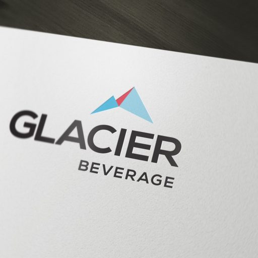
From the beginning
One of the many requirements for the brand mark was usability. Logo needed to be successful with just one color and stand out from others if used in conjunction with them. Furthermore, a simple symbol needed to be developed that could be used by itself to increase brand recognition.
The vision
Throughout many iterations, we have settled on a Nexa Bold typeface. The bold curves of the font create an iconic look that stands out amid the industry that’s populated by Helvetica or Script Fonts.
For the symbol, an abstract shape of a mountain was created. We placed it off-center, thus making the eye follow from left to the right when reading the logo. Making “Glacier” bigger and bolder makes the logotype easier to read. This is also inline with the original style of the logo. Because of the color contrast, the word “beverage” will be seen second thus finishing the composition.
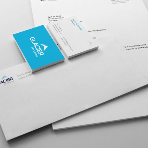
Centralize Collateral
For collateral, we wanted to create a simple effortless look that could be kept for many years to come. This is one of the reasons we kept design elements to a minimum and instead focused on typography and negative space.
One side of the cards was designed with a solid color that would make cards stand out from others. On the opposite side, we used spot UV on a text with foil on our symbol to give cards a more luxurious look. A foil symbol was also added to the back side of an envelope. When creating collateral the little details like gloss and foil end up making a huge difference in the overall feel of the brand.
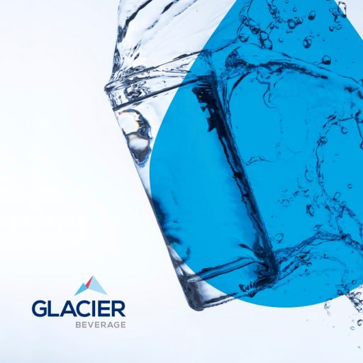
Strategy and Marketing
This brand ended up having many support colors and 3 primary colors (Coral, Dark Blue, and Summer Sky). This allows designers to create very versatile marketing materials with subtle shades of color.
For body typography, we ended up going with Lato Regular. Because of its subtle roundness, it offsets the would-be unapproachable enterprise look and makes content easier to read. Additionally, the font also looks great on the web.
Finally, a complete design manual was created with specifications to keep the brand on track for years to come.


Results
Through a complete brand and collateral overhaul Glacier saw significant increases in their primary B2B sector. Now poised as more established and trustworthy brand who has solid brand marks themselves they have reported an ease in closing new partnerships for whitelabeling.
We also delivered a complete design manual that was filled with specifications to keep the brand on track for years to come.
